28 May 2013

Too Busy to Blog

That's it, really. I've been busy with working on the house, working on the yard, getting kids through the school year with decent grades and then into summer sports, and actually working, to blog about anything much.

Here's a quick list-format rundown of things we've been working on, house-wise:


Repainting the inside of the enclosed front porch, so it can be a functional playroom and office. The playroom half is done in blue and clouds, a lighter version of the murals in the kids' room, With a bit of functional chalkboard paint, and the office is white, with the columns (erroneously, as it turned out) sketched in dry-brush style in blueprint cyan.

Gardening - in front, in back, the side yards. I had the most spectacular poppy bed, and then we had a storm.

This photo is from last spring's first tiny starts. Nearly all have survived the intervening year and my dianthus to either side of the porch steps are now enormous, over a foot tall. I've expanded those beds as far as the corners of the porch and  added beds to either side of the steps down to the street.

It was a long winter (snow until the end of March!) and I leapt into gardening as soon as I was allowed to. I've spent days out there getting filthy and sunburnt. It's still very small beginnings, but it will become lovely over time. Also, I already have one hard green tomato. Any further gardening talk gets its own post, because I can go on and on about gardening.


Reorganizing and updating the kids' storage in their room. This was a big project and involved finding things that worked with much of what we already had, and which will transition well from little-boy to big-boy. Tougher than you'd think.

Going through boxed up outgrown toys and baby things for hand me downs to pass on. I got rid of about five boxes of stuff that way. No pictures. That was pure chaos!

Turning half of the unfinished dining room into a temporary kitchenette, with various freestanding storage things, in order to make it possible to work on the kitchen. Also, no pictures. We've already taken out six 1940's steel cabinets in the kitchen, it's a madhouse. All of those will go to the laundry room.

Preparing for the kitchen renovation has been really absorbing. Most recently, we've been getting the cabinets measured for, and ordered. We've driven all over hoping for a wonderful deal on period-appropriate tile, like we got on the bathroom, but will most likely end up using reasonably close stuff from a big box store.We already have the new sink, and the new fridge and stove, but the sink isn't installed yet, plumbing and gas needs moving about. This, also, will get its own post. There are drawings. And a bushel of photos.

Now, those old cabinets, the ones going into the laundry room? The laundry room doesn't exist yet. This has been stressful, but it's a part of the Big Plumbing Adventure that needed to wait for spring and the end of freezes to take care of. That's coming up in a couple of weeks, and will mean a few days without water.

Finally, I spent a big chunk of winter being (curably, but miserably) ill and stewing over delayed renovations by sleuthing other houses. Thanks to an online house-aficionado acquaintance, I managed to locate another Sherman/Sheridan. Sadly, it's probably been torn down, as it was a tax default sale. That, too, is another story for another day.

25 November 2012

Floorplan comparison

Here is another bit of comparison, for those who might want it. This is the floorplan of the house as we are guessing it was originally built, based on what we have found during renovations, compared to the floorplan from the catalog.
Differences:

  • The tiny foyer was left out. Not uncommon.
  • The closet's doors were reversed whenit was built, either error or by request of the original owners, and its intervening wall was also omitted (we removed the closet wall into the large bedroom to make space for modern bedroom furniture, so it's gone now).
  • The location of the back door is guessed,  that wall was turned into a cutout into an extension onto a porch addition sometime between 1921 and 1950.
  • The dining room windows are assumed based on the catalog plan, also, because there was a poorly tacked on bay added in the 20s, at which time the entire dining room wall was removed. The bay was centered on the original window configuration, and is therefore not centered on the dining room itself. The plan's locations for these windows made the strange offset finally make some kind of sense!
  • The kitchen door was set in the hallway, rather than in the dining room, probably to accommodate an existing coal cook stove (left hand side orientation of the stack, probably, and perhaps a right hand side access for the ash or coal? Wish I knew!).
  • I have not yet taken down a later corner cabinet where the pantry window was supposed to be, to see if there is a repair to the plaster there. On the exterior, this area is partially covered by the added on bay, so no evidence shows there.

Another change made after building was an opening into the dining room from the front bedroom/study. I omitted it because I found evidence that it was altered later. We have filled it in and plan to add a built in buffet in that space.
Next update will show the current configuration of the house, contrasted with the plan. That's all for tonight.

21 November 2012

A Little Comparison, a Few Conclusions.


So, today I got out and took a photo of the house from nearly the same angle as the catalog photo. Not quite, but close enough to do an overlay. I need to scoot over about three feet and take another picture, but that has to wait for the camera to recharge. As it was I ended up using the webcam on my tablet and guessing the angle, because I got out there, set myself up to shoot based on the catalog image on the tablet and had a dead camera. Got to love modern technology, huh?
The front bedroom window and front corner line up. The replacement front steps line up with the originals. The roof line might line up if I can somehow get more on a level field with the house. Maybe by standing on a chair on the raised sidewalk across the sunken street. The lack of dormers is glaring, and I know those were there, you can see their ghosts inside the attic. The chimney doesn't line up, but that may be due to the error in aligning the photo just right. The modern siding on the now-enclosed front porch thankfully wasn't continued around the whole house, but the eave overhang was inexplicably closed in with ugly flat ventilation soffit and I fear that the lovely shaped rafter ends were likely trimmed or removed to fit under it. At least the rest of them were not covered up.
It has really underlined how much has happened to the house in its 100 years. I am both happy about this and sad, but not surprised.
I have the front porch interior half painted (the kids' half, of course) and I discovered something that is significant and not unexpected. I knew the sheathing of the columns had to have been either mangled or stripped away in order to put up the siding and interior paneling. I found the ghosts of the columns etched into the old exterior front wall, at both ends. The angle of the column sides and shape of the capitals match those in the catalog picture. This will give me something to work from when we restore the porch. While we want to keep it enclosed, it will be changed to a more sensitive style of enclosure, with the columns replaced, exposing or replacing the curved beams, removing the awful siding and soffit panels, reshingling the porch wall up to the rail and putting in more period appropriate steps, windows and front door. It is an ambitious plan. It is one of the last things on our list.
One more thing - the floor plan in the catalog shows the dining room windows are not centered on the dining room wall. The addition, put on in the 20's (and done by an awful contractor I would love to have some harsh words with), is also not aligned to the center of the dining room. It is off by almost, but not quite, a foot. The discrepancy in one explains the otherwise random discrepancy in the other. It looks as if they laid the foundation for the bay addition, aligned to center on the pair of windows, then tore out the wall, and discovered that it was out of line with the room.

08 August 2012

Kitchen in progress, Part 1

So, we decided to change our plans. No Ikea kitchen for us. No prefab cabinets at all. We are going totally custom, and doing it ourselves. ALL of it. Cabinets, sink, 20's style banquette, and built ins.

Not exactly this, anymore.
Why? Well, frankly, Ikea is too far away to realistically be able to get spare parts, 6000 dollars is a lot to spend for not-quite-fitting cabinets, and ... a good friend of mine got defrauded by a cashier at the Atlanta GA Ikea, with a very poor response from Ikea loss prevention (I would not shop at that one for a while, folks. Go elsewhere). Thus, between the distance to the nearest Ikea and the bad taste that their treatment of my friend left in our mouths, we elected to take our business elsewhere.

Perhaps a bit more like this, instead.
The plan:
The layout will be very similar to the posted plan examples. Sink and dishwasher (yes, I have decided I want one) under the short wide window in the middle of the kitchen, double door fridge next to a pull out broom closet, cabinets up to the ceiling, banquette where the big 1940s/1950s double sink cabinet is now, stove on the wall with the chimney, racks/rolling worktops in front of the long windows. Lots of integrated stuff, a pull out trash bin, a fold-out ironing board set into the door of the broom closet, probably an appliance garage too. I'll be using furniture grade plywood for the cabinets and hardwood for the doors.

Tools:
Level, table saw (borrowed), finish nailer, drill, sander, router and table, and whatever else we already have or need to get or borrow.

A little of this one, too.

References:
The cabinets will be white, probably with chrome hardware. The appliances will be modern, but white. The floor will be white with black accents.  Backsplashes will be tiled, white with black and little bits of red. 

We are seriously considering doing a custom cast concrete sink and drainboard, and possibly cast-in-place concrete countertops. The other option being tile, as I love to lay tile on counters. Not so much on floors, but I am already committed to tiling the floor.

The walls will be white beadboard wainscot from lintel height to baseboard where they are visible, and bright red above (possibly there will be a frieze stencil design, but not too keen on that in a kitchen environment). The ceiling will be papered over the drop ceiling tiles with a tin-tile pattern relief paper, and that will be painted white.

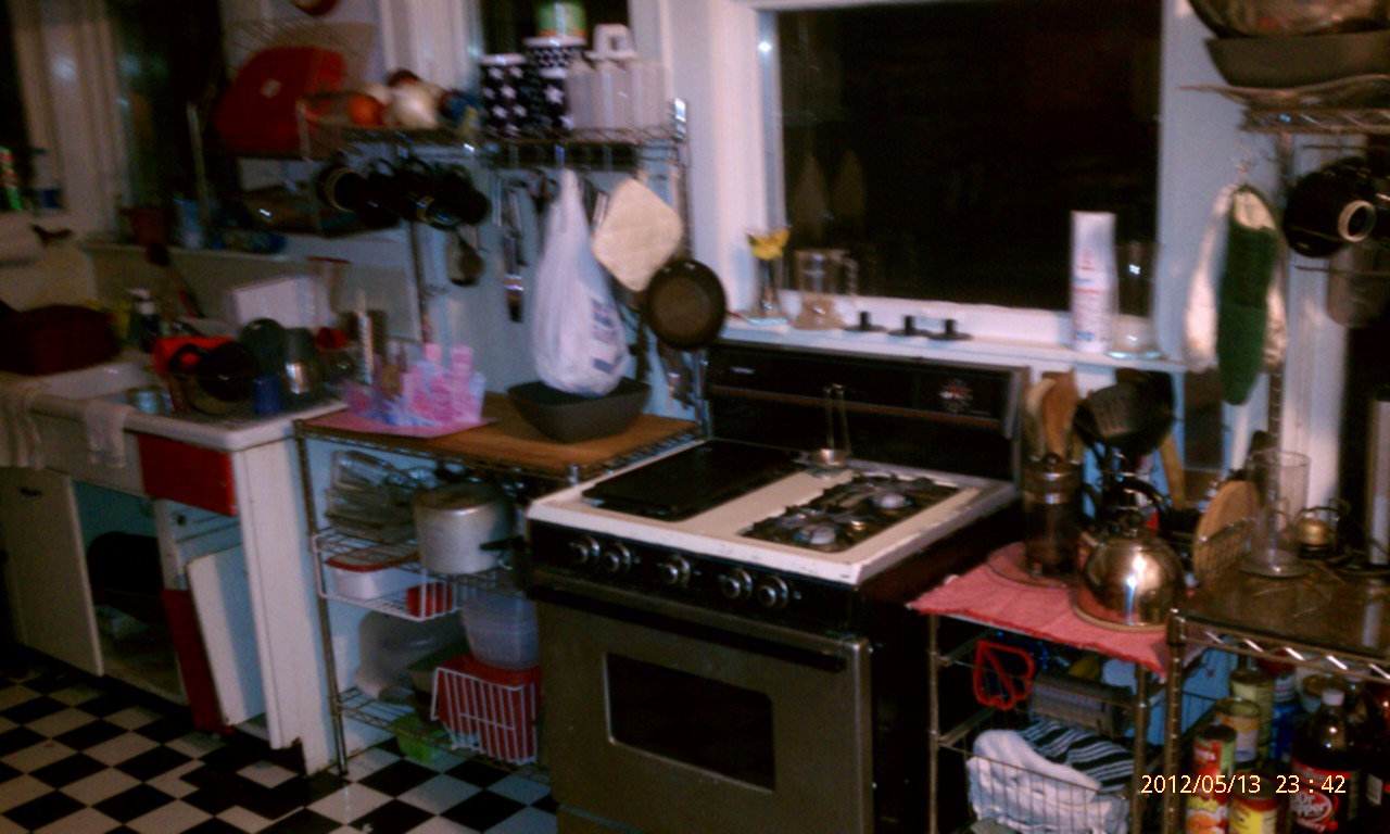
There are no good pictures of my kitchen, it's a series of unfortunate shortcuts and concessions all piled on each other, ruining the original flow and wasting all the space. 
All of that is eventual. The current status is vinyl sticky tile, steel cabinets that don't fit the space (and which will become my laundry room cabinets after the reno), and not enough of them, the old sink cabinet that is over an unheated extension and is also falling apart despite heroic attempts to save it, and the new stove and fridge. The fridge is currently sitting where the stove will go, and isn't hooked to the water because that's not going to be over there. We'll run the line when we run the new supply and drainage lines for the relocated sink. Which would be the week after we get the pros to run the gas line back to where it used to be and close off the current stove line safely.

It only looks this good good because I faked up some subway tile with stone-pattern sticky tile. I had to. I hated it. See that curtain around the sink cabinet? It's hiding the doors and drawers that fell off. The banquette will go here, soon.

We have the fridge, so we can design, plan and fit the fridge wall cabinets around it now. I plan to build the frames and install them on their bases, and build and hang the wall cabinet frames. Doors can follow after the rest of major work gets done - I've removed doors as a cosmetic choice in when I was a renter, reinstalling on move out, so it won't bug me. A bonus to this is that we can take our time to hash out pulls and knobs. I don't want anything that might catch on my clothes or anything since it's a narrow space, Mr. Vintage House wants knobs and protruding handles. We have months to argue before this becomes an issue.

After that, the stove wall cabinets get built and installed, the stove gets moved, and we start on relocating the sink. After the sink is done, we will build the banquette under the corner windows and have someplace to eat besides the living room.

Progress, why does it feel like sliding backwards?

23 July 2012

Frieze Angst

Got my frieze paper samples from Bradbury & Bradbury.
They are breathtakingly gorgeous. And yet ... None of them is right.

The largest one, Land's End, is so ideally Arts and Crafts and so beautiful that considered spending far more than we had budgeted for this, but I simply can't pretend that it is not too large. And it's a coastal view, when I had wanted to echo the riverine environment of Southern Illinois.

 Of the others, which are riverine motifs, the second, River Frieze, is lovely on many counts. It is our hoped for theme, a more modest size that would work well with a lower wall placement, and an entirely budget friendly price, but it is far too much green when paired with our wall paint. The third, Birchwood in the new Rookwood colorway, is perfect, all the colors are ideal and don't overwhelm with the pain we chose, but it is too small. Much too small, even in the new larger format released recently, because this border would need to be placed above the picture moulding to look right in this space. Alas. I had such high hopes, but our space had other plans and our budget rules out asking for a custom print job.

 My next idea is to paint a frieze myself. I can and do paint, landscapes especially well, and murals aren't unknown to me. I can get the colors just right, and I can make it fit. Now to sketch it out.

I've created a board on Pinterest just for collecting inspiration photos. I am thinking of sketching out a 12 foot section and repeating it, or possibly going mostly freehand all around the room. Also, incising the pencilled design into the plaster before painting is looking like a nice touch. I am researching period decorative painting methods right now.

14 July 2012

Insulation for the WIN!

It's been quiet around here, but we've been busy with PeeWee Baseball and summer vacation.

Speaking of summer, it has been astonishingly hot. So hot I could barely use my own kitchen, since it would get about 10 degrees hotter in there than outside, if I wasn't cooking (on the highest days, that meant it got to above 115 in there). The rest of the house was really just barely tolerable, with two window units going full blast we got it down to the high 80's or low 90's in the rooms with a/c.

So, between bouts of heatwave, we ponied up about 200 dollars and my husband and our good friend J put GreenFiber blow-in cellulose in the attic. It took them about 4 or 5 hours, including breaks. The attic is now insulated to R-19 or a little better (we used the r-19 calculation that didn't make allowances for framing, and then added one extra bale), and it has made an amazing difference. Mostly, it shows in that the house isn't heating up so fast in the morning, and the cooling is lasting longer with less active cooling being needed. It has made such a difference that we saw a 15-20 degree difference vs. outdoors in the rooms without air conditioning during the day, and 10 below the outdoor temp in the kitchen, even with the stove getting used on and off throughout the day.

This is my favorite thing so far: I was able use my oven and cook a full meal today, without getting heatstroke. Furthermore, our enclosed front porch, on the west end of the house, which is usually best described in warm months as "ovenly," was actually comfortable, and it got up to 92 outside. Usually it is already intolerable when it's up in the 80's. That bodes well for the next time triple digits roll in around here. And, frankly, it bodes well for wintertime as well.

Tomorrow, heat-reduction tint goes on the west-facing windows. That small improvement should also help the front porch be more usable through the year.

16 May 2012

I got it!

The foldaway built-in ironing board cabinet, that is. The door is there, the cabinet itself is in great shape, with all moving parts intact. It's very petite, so it will work perfectly in its intended use as an in-door mounting on a pull-out pantry cabinet.

It has the sleeveboard, and the pop-up support and the covers are still on both boards, so patterning new ones will be a breeze. It has never been painted, so no stripping needed!
Edited to add this image from a 1920s catalog for Ideal Furnishings, what looks to be exactly the model I found.
The folks I bought it from are moving, which why they are selling off their salvage. It is a pity, because they are awesome people.


15 May 2012

Blue Greasepencil

Remember the post about the greasepencil mark? Well, we reorganized our salvage lumber, and about eight of the studs (out of one 12' wall!) say "SP1" in black and blue greasepencil. There are also some carpenter's notation (lengths, probably for custom adjustments on site) on one or two pieces, in graphite.

Greasepencil is one of the identifying marks for kit homes.

14 May 2012

Wish me luck!

Why? Because I might have a line on a foldaway ironing board cabinet, salvaged, in what looks like decent shape. If I can get it, I will mount it as the front of a pull-out broom closet unit. in my redone kitchen.

Cross your fingers for me!

12 May 2012

I have never been so glad to be wrong.

What was I wrong about? Well, folks, remember this post? I thought the house wasn't a good match to the Aladdin Sherman from the 1912 catalog because of the measurements I had of the exterior.

Those measurements are based on the exterior measurements of the modern remuddled enclosed porch, over the vinyl siding. The vinyl siding adds about 6" to the width on each side, because it is simply laid over the original porch structure, including the rail. That structure isn't calculated into the footprint of the plans.

If you go by room dimensions, the house is IDENTICAL, except for the tiny foyer and pantry walls having been omitted. Well, and the closet dividing wall was also left out, and the closet doors were built in reverse of the original plan, the kitchen door was moved into the hall, and the pantry window was left out since there is no pantry wall. There are double doors into the den from the living room, plus that open arch into the dining room from the den that may or may not have been original, and which we temporarily filled in, so the room could be usable as a bedroom.

I am sure the house is a Sherman, now.

I just wish the scan was clearer.

23 April 2012

It's been quiet, but...

... that's because we are finally in our house, living here, and we even have internet! We moved in this last weekend, and I have a big backlog of stuff to show you. This is just a preview.

Before move in, we finished our bedroom. It's not perfect, we haven't had time to refinish the floor and blend the ex-closet floor into the bedroom floor, but it's all done on the walls and ceiling.


We also got a lot of the rough plaster repair done in the dining room, though it is far from finished.


One big thing I did was non-house carpentry. I built a base for my sons' Ikea Kura bed so that it could go from being a platform bed with a mattress under for a 7 year old and a 4 year old to a real big kids' bunk bed for a 9 and a 6 year old.

26 December 2011

Research: A possible match

Well, it looks like my odd little house has even stumped Rose Thornton. That's hard - she knows a lot about kit homes! Her best guess is that she thinks it might - maybe- be a Gordon Van Tine. I have asked her to ask Dale Wolicki if he recognizes that floorplan in his collection, as there are currently no pre-1920 GVT catalogs online.

However, that made me go looking again, in hopes that I might find something useful. And - I might just have done so!

Thanks to the Clarke Historical Library's online archive of Aladdin documents I may have found a possible match. In the 1912 annual catalog, there is a little house called the Sherman. It isn't in the 1910 catalog and there is no 1911 catalog in the archive.

Its footprint is off, it's a little narrower, (ETA: I had the dimensions wrong!) exactly correct, 26x48, and the room dimensions are a little off (another ETA) practically identical except that they are given as divisions of the plan, not wall-to-wall measurements (plus there is a pantry where my house has none), but this is the absolute closest house plan I have yet found. I wish the scan was clearer, I've tried to refine it a bit for my example, but it wasn't very good.


Here she is in the 1913 annual, with two plan options. Neither is as good a match to my little oddball as the 1912 plan (or to the exterior illustration! look at the windows). The only real difference between this one and the next year's example is that there are people in the image, and the scan is clearer.

By 1915, it's clear that no more changes are being made to this design, or even the catalog page, except perhaps for typesetting. The 1914 and 1915 layouts are almost identical. And, in the 1916 catalog, I think I may have hit upon an answer as to why the Sheridan looks so very very much like my little mystery kit home. In 1916, the Sherman's name is changed to the Sheridan, one plan gets updated, and the exterior image finally gets a full update to match the changed plans. 

Look how the unaltered windows (the dining room and kitchen windows have significant alterations in my home) line up with the plan! At this point, while I am very optimistic that this house may, in fact, be a customized 1912 Sherman, because of the differences shown in the overlay image above, it is still equally possible that the 1912 Sherman is a copy of a similar house from a competitor's 1911 or 12 catalog. And, of course, if it is an Aladdin ... why is it all Sears on the inside? What this has given me is a concrete time range for the design of the house. I always had a feeling it was early teens, and now I am certain of it. It makes the search more focused and I am very, very happy about that.

Research: What the House is Not

I've been saying recently that I have pored over - without any success - numerous online and print resources, without being terribly specific. I really ought to share where and what I have looked through. I've mostly focused on the best (most local) companies, since my town is on two north/south rail lines and Chicago and Cairo were likely sources. Another clue about this being cut at an IL mill is that the house is mostly, if not all, cut from cypress. However, while makes the house nearly bulletproof and resistant to water damage, that fact doesn't narrow the options any, since local lumber mills in IL cut lots of cypress lumber both for local and regional use. Sears even advertised cypress as a high-quality budget option for floors and millwork (cheaper than oak or birch, but not by much).

Features that make my house easy to identify:

  1. Odd footprint size -apparently 28x48 overall is a weird footprint for the period.
  2. One floor (fairly rare in a house of this size among all the various plans).
  3. The arrangement of the bedrooms and closet between.
  4. The bath positioned at the center rear of the house.
  5. The kitchen is not square.
  6. Front has two living room windows, the door, and the den/parlor window.
  7. That crazy angle between the living and dining rooms (this may have been a custom feature, though it was still fashionable in the 1900's and early teens).
Superficial features:
  1. Porch design, tucked under the hipped roof (could easily be customized).
  2. Hipped dormer attic vent (now missing).
  3. No living room or parlor fireplace (house was heated with stoves originally).
  4. Lap siding, millwork and interior hardware are all Sears (and original, there is no sign whatsoever of the interior hardware ever being changed).


So, here you go, a quick illustrated guide to what this house is not.

From the Winterthur Archive (these examples are created from their archive scans):
Chicago House Wrecking Company 1913 house plans book.

The best candidate is the 119A - It looks good, from the outside, except this house is wider and has a different roofline, footprint (31x38) and similar, but still off, layout.

Montgomery Ward Book of Homes, 1916 (date taken from wallpaper book ad at end of catalog).

It isn't a 156, because the footprint (32x39) is wrong, and the plan is also far off. The only real similarities are the outer appearance and bath/kitchen positions. She looks a lot like my house, though!

Plan Book of Harris Homes 1915

The closest I could find is this one, the L-1001. It's not really even close, footprint is off, appearance is wrong, all details are wrong.

A later undated edition (all houses are "N-" designs) has no likely examples beyond the N-1001, which is almost identical to the above excerpt. Another I would assume comes between the two has houses designated "M-" and is equally unhelpful. Nearly all Harris Plan Book houses have a side-located bath in the one-story models.

Aladdin Homes "Built in a day" catalog No 29, 1917

It's not a Sunshine, though it is very close in some significant details, like the kitchen/bath/back bedroom arrangement (this is a very Aladdin style layout, actually), and the chimney stack position. Footprint is close but wrong, roofline is wrong. The Boulevard is just as close, but too small, as is the Stanhope.


Oh, now we get to the Sheridan, which really, really looks like the old girl. I mean, look. Just look at her.


They could be twins. But all the other details are off. Plus that pesky all-Sears interior.

Then there is the Cadillac, which really looks like a similar plan, and is even 28 feet wide. But the room sizes are all wrong. All of them. It so close to right but it's not.

This concludes the selections from the Winterthur Museum Library (courtesy of archive.org).

There are no Sears Home Catalogs or Gordon Van Tine Ready-Cut catalogs earlier than about 1920 on the Internet Archive. I have compared the 1920s GVT 548 with my house and while there is a superficial resemblance, they are far from the same house, the 548 is too narrow and has the wrong plan. Likewise for the 1920s 533.

I also have several Aladdin and Sears catalog reprints, plus The Houses That Sears Built and Houses By Mail and have voraciously read everything Sears and kit home related I can find online, and I can tell you that I have not yet found a precisely similar house. I am at a loss and I would be deeply grateful to anyone who might be able to point me to one.


Research: A resource for kitchen restoration


The Kitchen Plan Book, 1920 Published by Hoosier Manufacturing (the cabinet people!) is available at the Internet Archive's online texts archive. It is a free download, or you can read it online. It's the collected best submissions from a kitchen design contest, and shows a fantastic variety of kitchens from classic mid-late 1910s bare-bones rooms with wood stoves to ultra-modern, deluxe, fitted kitchens that would not look out of place in a modern home.

Here are a few excerpts:

This one is for a small kitchen not unlike ours. I want built in everything, like this little kitchen has.


I especially love this one, though it's for a much more architecturally interesting house, with an octagonal kitchen. It looks like something you might find in a new house with a modern fitted kitchen.

Advice, if you want to download it: remove the extra periods from the filename, or your pdf reader will tell you it's a corrupted file.

If you want to get a hard copy of an earlier one, American Bungelow has their reprint of the 1917 edition of the Kitchen Plan Book (all different designs from this one, different year's contest) on sale, half price.

25 December 2011

A clue! But what does it mean?

This is the only greasepencil mark we have found so far. We found it when we demoed out the wall between the master bedroom and the closet (which was VERY nonfunctional and which we plan to replace with builtins/wardrobes), and then I misfiled the photo - only to find it today. That is a stud, actually 2 inches by 4 inches. Since it is vertical, this could be read any sort of way:

  •  SP1
  • 1d5
  • 1dS
  • SPI
  • Id5
Does anyone know what it might mean?

I'll be shop-vac-ing the attic soon, and I expect to maybe find more marks.


24 December 2011

Return of the Kitchen Plans

Part of gearing up for a return to work on the house is updating plans, and updating cost lists. One thing that hasn't changed is that we intend to use Ikea kitchen cabinets as our budget solution for making our kitchen more usable. We are going with white Adel cabinet fronts because they look the most like what used to be here (we found the remains of a door in the basement), and using hoosier-style pulls instead of knobs and handles because, as big a room as it is, it is still a tight space.


I wish the Ikea planner gave a little more control over the walls, and I don't really understand why the stove hood won't fit in with the short open shelves (there will be a vent hood there of some kind, but we may have to fabricate it ourselves), but I'm happy with the general look. 


I love the light in the room, and I never, ever wanted to cut those long windows in half, as I would certainly have to do if I let the cabinets and counters cut across them. I also want, but don't have room for, a permanent kitchen island or kitchen table in the middle of the room. Given these two factors, I decided to use kitchen carts  as combined movable workspaces and additional storage for things like mixing bowls, the wok, baskets of folded kitchen towels, art materials for the kids, all kinds of things we won't need to hide.

The sink is getting put back where it used to be, under the short wide window where the stove sits now, looking lonely. Where it is now, it has the water lines running through an unheated, uninsulated space under what was originally a porch that got enclosed some time in the late 1920's, and expanded into sometime in the 1940's. That space is a perfect spot for a table and a couple of benches for eating, doing homework or making messy crafts.

This is what it looks like now, with a round table, all the counter and most of the storage on one side, the sink crammed up against the back door, and the stove hanging out in the middle of one wall. So much wasted space, not a great working layout, and a bunch of great 1940's steel cabinets that will become my laundry room cabinets when we do the kitchen reno.


Here is the plan view, showing how much better the new layout (which is likely not too different from the original layout) will use the same space.


The fridge/storage/pantry wall, with some workspace (I foresee the microwave and telephone taking up residence here). Those tall cabinets are the pantry and cleaning closet, the high cabinets will be more pantry. Yes, I have already purchased my stepstool.


The old Ikea planner version of the kitchen redesign, with the medium brown wood finish Adel fronts and gray counters. Between my research showing that white was popular, locating the white cabinet door in the cellar, and realizing that a long narrow room like this never benefits from loads of dark wood, we elected to go with the white. However, as you can see, the basic plan remains the same.

And an overview of the kitchen from the new planner, with the white Adel fronts, more open shelving (we like putting coffee cups, spice and dishes on display) and better-fitting carts. I expect my entire basement will be filled with boxes in short order, though the renovation isn't going to happen until spring. 

Oh, I forgot to mention the best part: the cost for all the cabinets, counters, sink and furnishings is under 5 grand. Yay Ikea!

21 December 2011

On the longest night

Whatever midwinter festival you celebrate, don't make it about greed, or selfishness. This time of year is meant to be about pooling our resources so we can get through the dark and cold months, alive, together. Everything else is just set dressing and hyperbole.

Something I can defintively associate with this time of year, ever since I struck out on my own, is that all the world seems to strive towards obscene excess, leaving so many on the sidelines, outside looking in. This atmosphere counters what is supposed to be going on, if you listen to the songs and stories, essentially highlighting how little most people can afford to give to others, and how little most people can afford to have at all, in the face of orgies of consumerism and public plenty. 

The holidays are only full of joy away from all of that, away from comparing haves and have nots, away from all the implication that those who have and get less should be somehow more grateful than those who have and get more than anyone needs. I think this is especially important right now, with the longest night being more than the literal one, and the cold being much more than weather. Some of us have hungry faces outside our windows and some of us are among them in the dark and the cold. The only way we might survive is by pulling together.

Maybe at the end of it, there will be warm sunlight and hope. 

15 December 2011

Emerging from hiatus, and a request

UPDATE: Dimensions were wrong, and a typo led me on a wild goose chase. Please read the posts tagged "aladdin sherman".

It's been 4 years of near-total inactivity here, but there wasn't much to report. We've been on hiatus, my husband has been deployed a few times, and we are finally getting to get back to work on the old girl.

I've spent the intervening time researching things and making plans, and I have figured out a number of things about this house. Not one of those things, and none of my extensive research, has given me anything like an answer as to which architect or kit company she came from. Not a bit, despite having practically had a love affair with the online texts section of the Internet Archive, and spending way too much time with Google Books. So, in the spirit of warming up a cold project and slowly getting it into gear, I am going to ask you for some help. Here's my question for you:

Does anyone out there recognize this floorplan? I have yet to find a house with a 28 x 48 26 x 48 footprint with a 28x40 26 x 40 cellar/foundation. I made a few rough scale drawings of what the house looked like before three different additions were tacked (or frankensteined, in the case of the dining room bay) on, and before the porch was closed in and roofers removed the vent gable. I think I ought to have drawn the steps wider, but I have no idea what the original steps might have looked like.

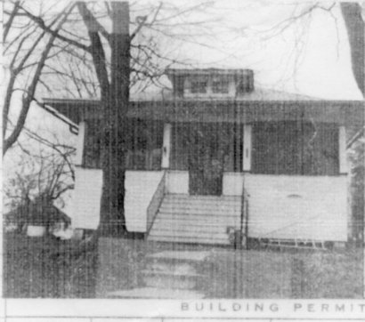
Here's the only photo I have been able to find prior to the changes to the porch:


What we do know:

  • The county tax assessor has a single sheet of manila with a tiny photo stapled to it, which I have been told dates from the late 1960s or early 1970s. The build date on the house, according to this document, is 1925. However, as records are incomplete, I have been told that could simply be a sale date, or the date the property record was recorded in the county office. Nobody knows.
  • The younger daughter (Edith Heppe) of the family that built it visited the late former owner of the home about 15 years ago, and a statement about the house was written down from her childhood memories. We have this statement and I have transcribed it here
  • Mrs. Heppe remembered it was built by her father, and her parents moved to Centralia in 1921, so it had to have been built before that time. 
  • It's got Sears hardware throughout, and all the original millwork is directly out of the Sears millwork catalog. 
  • It originally looked rather like an Aladdin, if you go by that little black and white photo. But it does not match any recognizable Aladdin plan, or even a footprint of any similar style of home, that I have yet found. Also, the interior millwork and hardware and NOT Aladdin.
  • I've found a similar footprint in Wards and Chicago House Wrecking company catalogs, but nothing like this plan or style in combination with the footprint.
  • It's got an odd arrangement of den/living room/dining room that is indicative of an earlier house, so really, the latest I would put it at is 1914.


In other news, I finally know what to do with the back bedroom. More on that, and the kitchen remodel, later.

21 January 2008

Q&A time! More Sticky Tile Advice

We are still on Hiatus, but I got a question today that I think is worthy of a small update. A lady named Marie posted a comment on this post asking for help with her self-adhesive tile installation:

i had tile put down this summer 12x12 good tile he pull up all the old tile & cleaned the floor put down some wood then the self stick tile now every time i walk on it ,it sounds sticky.What can i do about it. THANK U MARIE


Marie, I'd have emailed you but you didn't leave an email address :)

It sounds as though your installer did not level the floor properly. Applying a new substrate is only part of the job - the substrate must be levelled and smoothed with a filling compound and allowed to cure, then sometimes re-levelled, before tiles are applied. This is even more important with larger or self-adhesive tiles, as they require a perfectly level surface to adhere properly.

The right application tools are very important. Having some way to press the tiles down, such as a roller, is crucial to bonding the tiles in place. If this is not done immediatley after the tiles are applied (usually after the entire floor has been laid), the tiles can release from the floor due to temperature fluctuations, and make a sticky noise when the floor is walked on. It is equally important not to walk on the new floor for the time recommended on the tile package, as walking on it may cause the adhesive to slip while it is curing.

Also, the quality of the self-adhesive tiles can significantly affect their sticking power - I've used expensive tiles and cheap ones, and universally had cheap tiles slip, peel and creep, even when thoroughly pressed down with a weighted roller. I've had best luck with the Armstrong brand of self-adhesive tiles, though the quality of tiles they produce is also affected by the price range and intended use. Some cheaper tiles will peel right up on a hot day, for example.

A slightly uneven surface is one of the reasons we chose small, ceramic tiles for our bathroom. The cost would have been approximately the same for inexpensive tiles (our ceramic tile was about 1.80 a square foot) + grout + substrate + leveling and filling compound vs quality self-adhesive tiles (generally about 3.00 or more a square foot) + substrate + leveling and filling compound.

On the positive side, it tends to be fairly inexpensive to pull up and replace self-adhesive tiles in order to correct insufficient floor leveling. Good luck!

29 November 2007

It's Been Lovely, Wish I Was There.

Arts & Crafts Homes Magazine. Looks fun. Might get a sub for myself for Christmas, but it might make me crazy.

Yep, still on hiatus. Mom says the yard looked really lovely this year. Wish I had seen it.

Possibly some real updates in Spring, but I plan to have a few more house research posts between now and then.

Happy Holidays!