25 January 2007

Locks and shades

Today I did something we've put off for months, with no good reason. I removed this from my son's bedroom door: It looks fine, I suppose, but there's another facet to the problem. The latch itself is snapped off, even though the rest of the mechanism is fine:

Our three-almost-four-year old has been living in this room now for a month, without a door that closes properly. Ihat's fabulous if one only worries about escaping during a fire, but horrible if you want to be able to hear your toddler escaping during his nap. We've been making do with a bungee-cord hooked from his doorknob to the moulding, but it's both ugly and not great for the woodwork, not to mention not being ideal, safety-wise.

Today I took a step towards not jerry-rigging it, and ordered the replacement latch from Vandyke's that we had picked out ... Last August. It's ideal - same dimensions, comes with replacement strikeplates in case the original we have doesn't work with it, and it's relatively cheap.

For the curious, the works of the latch looks like this:

I may have mentioned that we had bought a replacement lightkit for our living room ceiling fan, and found that you can't get the kind of light we want (a single shade uplight)to work on the ceiling fan we have. I also do not wish to spend $150+ for a fan at this time to get what we want. The lights on the fan have been driving us nuts, however, as they are downlights just about perfectly angled to be regarded as interrogation lights AND the "shades" are actually clear glass, unfrosted, convex-petaled tulip shapes that function more as lenses to concentrate the light than as any sort of diffusion device. We have to live with this thing, but we can't stand it. In short, "ow."

Yesterday, I got tired of "badly designed light fixture"-induced migraines, and decided to do something about it. We went from this:
to this:


I built it out of card, armature wire, copper tooling foil (bought for another project and then not used - if I do this again I'll use copper flashing as it's WAY more cost effective), glue (duh), aluminum foil (to line the reflector panels with), and a scrap of the indigo-dyed organdy that I'm making my sheer curtain panels from. Soooooo much better. It's like breathing fresh air after being in a stuffy room, or putting on sunglasses in the middle of a scorching Texas summer day. I plan to reinforce it with square wood dowels in a week or so (I have them, but they are still at my mother's house), since it's bowing a bit from the pressure of being mounted, but overall, I'm very pleased.

If you'd like to make a shade yourself, I highly recommend this book. This wasn't the first shade I've made (I have made several Japanese style wood-and-ricepaper shades and a few cloth ones), but it was my first copper-and-card one. The book made a great reference for shaping, though it's not a design from the book, there are several similar projects.

17 January 2007

Castles in the Sky

Or, "Cabinets in the Kitchen." It makes no difference, because one is as real as the other, unfortunately.

However, dreaming can be fun, so I downloaded the Ikea kitchen design software and went on with my imagined redesign of the kitchen. I'd been playing with various configurations for some time in my other 3 remodeling software packages, but this really works well 9this year - last year's crashed on me too much to bother with). We're considering Ikea as a source for reasonably priced cabinetry that we can install ourselves, so this gave me a nice idea about how much it might be to get the whole mess from them (under 7 grand, including fripperies like a stove and a dining area, and not including shipping). There's the added fuzzy of following a kind of tradition - the house and everything in it having originally been ordered from catalogs - even if this is just a pipe dream.

First, here is a rough approximation of what we've got now, Ikea-style:


I'm guessing, from the five or so cabinet doors we found cobbled into a shelf in the cellar, that there was a basic kitchen built-in on the side where the counter is now, possibly also an icebox. The corner cabinet I roughed in in this is a homemade affair, cobbled together (fairly well, actually) form odds and ends of plank and tongue-and-groove boards, and goes from floor to ceiling. I like the midcentury steel cabinets, but they don't go with the house, and we need more storage and more counterspace.

Problems with the kitchen as it stands:
  • As you can see, there's LOTS of wasted space.
  • The current sink location is both counterintuitive and just plain bad - the supply and waste pipes go through an unheated space under the original back porch).
  • There's kind of a work triangle, but not really.
  • If we want a vent hood, we will have to cut through the outer wall of the house if the stove stays where it is. Not good.
  • There's no eating in the kitchen without traffic bumping into the hapless person next to the door.


So I have a few things in mind to change, and some things to restore. I started out with a bare room and the knowledge that the original location of the kitchen sink was where the range is now, the stove had been in the inset where our dinette is now, and went from there. I got this:


Wow. I went with one of the more traditional "modern" cabinet fronts, "Ädel," on "Medium Brown," as it seemed more like what was once here. I put the range in the original location of the cookstove, I moved the refrigerator over and put tall cabinets between it and the partial wall for expanded storage (including a broom/cleaning storage closet, which we do not now have), put cabinets on the stove wall, filling the awkward inset with useful things, and relocated the sink to the original sink location, under the short window.

In order to avoid removing or obscuring original features (the long windows, which let so much wonderful light into the kitchen), I elected to put kitchen carts or some other portable storage/workspace solution on either side of the sink. And the dining area? Where the existing sink is, so nobody gets elbowed or bumped during breakfast. The sink I picked is one of two that I really love in the Ikea catalog, the one that looks like a vintage farm sink.

It's so much more usable that I just want to buy it NOWNOWNOW. Of course, this is not possible, and will entail a great deal more than seven thousand dollars, such as living without a kitchen for a couple of weeks while we move plumbing around and install everything. Never mind the money.

10 January 2007

Writer's Block, or Living in the Project

NOTHING says "house restoration" like patched plaster walls, an extension cord, and a bale of toilet paper. Except possibly the direct view to the bathroom from the front door, and a nifty sepia effect courtesy my camera.

So, here I am, camera in hand, readied to relate the news of living in the house for a whopping 2 weeks, and I find that my grasp of words has failed me.

Utterly.

I find myself thinking "Kitchen ... NO! Bathroom ... wait. Bedroom. Plaster? Yardwork? Snow?" This is followed by a dull moaning sound as my brain's gears fail. Madly, I continue to hunt for things to write about, grasping at "Scrubbing floors, perhaps? Or the kitchen drains? Oooo! How about the cellar?"

I'm not short of things to write about. I'm spoiled for choice. My brain is whirling like a magpie in a sequin factory. Too much to do, too much to tell, not enough focus.

Therefore, with this decision (or lack thereof), I give you some photographs. And some captions. That's all I can muster right now.


Bath, before and after. See if you can guess which is which! My best clue for you is that there's no Homart plastic tiles in the restored bathroom. Or pink. I'm not a pink person.


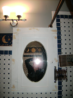
Here's the Original Medicine Cabinet, the one I bragged about finding so long ago, in her almost completed state (note the smears of wood filler). All installed, but not really finished yet. I'm putting off the rest of the paintjob until I get time to pull and strip (or replace with chrome copies) the hardware. The existing stuff is brass and would look ... odd, with the rest of the bath hardware being chrome.


Look, that's food in the kitchen, and not tools! Okay, some of those are tools, but mostly it's actual kitchen stuff. We can cook in here now, as of about a week ago. The first week, though, it was pretty grim, and we didn't get the tools packed of to the cellar until we were nearly starving for a lack of cooking space.

And, as promised, an image of (part of) the Giant Bed. It really does barely fit in the expanded master bedroom. This was the best picture I could get, as it's what was framed in the door. That's the baby napping on the bed, he gets his crib tomorrow. It's huge.

I will close with an image of the no-longer-hellish dining room ceiling, with the pretty, new, unfinished, "beam" for all to see. The real beam is actually much further up in the wall, and the posts against the walls are as cosmetic as the cladding over where the beam ought to be cosmetically (structurally, it's fine where it is). Don't look at the piles of boxes, please. Just pretend they aren't there.

That's what we do.

06 January 2007

Connected

We're online now, but the camera, being Mom's, didn't come with us, so pictures of the house have to wait until we get one of our own.

Still so much to do, but at least now it's home.